Do you like saving memorabilia and documenting everyday events? I do, and love that I can keep it in one place in one of Close to my Heart's "My Crush" books. If you would like chance to win one, why not enter this contest. Simply post a comment on Jeanette Lynton's blog, Facebook, or YouTube from now until Oct 31, 2013 to be one of 20 winners! Good luck!
Till next time, happy days!
4 October 2013
1 September 2013
National Stamping Month: September 2013
This month, Close to my Heart has a special National Stamping Month offer. Just make a $75 purchase and the "You are my Happy" trio of stamp sets can be yours for just $15. With a retail value of $64 that's a great deal!
Even better, you can also purchase the lovely pinwheel Stamp of the Month set for an extra $5!
Watch the video below then check out my website at: francine/ctmh/com/au
Till next time, happy days!
Even better, you can also purchase the lovely pinwheel Stamp of the Month set for an extra $5!
Watch the video below then check out my website at: francine/ctmh/com/au
Till next time, happy days!
22 August 2013
Exciting new opportunity
I'm really excited to be starting as a Close to my Heart independent consultant! I've received my starter kit, and even my first order, so now it's time to play. As I'm very busy with family matters in the next few weeks, I can't hold the open house I have planned just yet, but hope to invite all my Canberra friends to come along and view these great products in September. In the meantime though, I invite you to check out the products on my website here.
If any of you are impatient to see the products "in real life" before my open house, just send me an email or give me a ring and I'd be happy to arrange a time to show you. Here's a great video about the company for you to watch too.
I look forward to catching up with you next month, or maybe even before then!
Till next time, happy days!
3 August 2013
Close to my Heart
 |
| 2 Page layout using Chantilly papers and Complements (chipboard) assortment |
 |
| Complements (chipboard) flowers topped with pink glitter gems |
 |
| Complements (chipboard) flowers topped with pink glitter gems |
So, the next day I signed up to become a consultant and now my Close to my Heart journey is about to begin.
 |
| The card we made at the launch, using A True Thank You stamp set |
 |
| My kit! |
If you want to find out more about Close to my Heart feel free to email me (link in the sidebar) or check out my website.
Supplies used:
on the layout -
X7163B - Chantilly paper pack
X7163C - Chantilly Complements Dimensional Elements
Z1807 - Pink glitter gems
Z2118 - Desert Sand Exclusive Inks® Stamp Pad
on the card -
X5666 - Twilight cardstock
1385 - White daisy cardstock
X7163B - Cotton Candy *B&T paper from the Chantilly paper pack
Z1701 - Grey Wool baker's twine from the Neutral Assortment
Z1807 - Pink glitter gems
Z2193 - Cotton Candy Exclusive Inks® Stamp Pad
M1029 - A True Thank You stamp set
Y1003 - 2" × 2" My Acrylix® Block
*B&T = background and texture - double sided patterned paper
Till next time, happy days!
31 July 2013
Black and White Headshot

This
month's Scrap the Boys challenge was to scrap a black and white headshot of
your boy/man. With several boys/men to choose from, but having just visited my
Dad in Canada

I
started with sketch #105 by Susan Stringfellow which I turned 90 degrees to the right. I like her sketches since they're
always fairly clean with an emphasis on the photos, but still have room/scope for
embellishment. I loved making the stitched border around the central photograph
and patterned papers.

To
make the little embellishment cluster, I cut a piece of green ribbon into a banner
shape, covered the floss holder with patterned paper and then wrapped it in the
ric rac, covered one of the chipboard banner flags with patterned paper, and
layered it all on top of a die cut made with my Fancy That doily flower 3 die. I added the circular and heart shaped paper clips, and it was done!
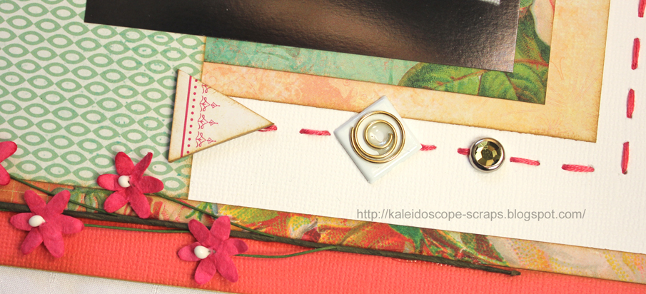 At
the bottom of the page I added the flowers using diamond glaze, as I did for
the paperclip on top of the large white brad. I think that lifted the brad just
a bit. Even though there is an eclectic mix of embellishments on this page. I
like how they all work together.
At
the bottom of the page I added the flowers using diamond glaze, as I did for
the paperclip on top of the large white brad. I think that lifted the brad just
a bit. Even though there is an eclectic mix of embellishments on this page. I
like how they all work together.
If
you come to my blog often, you know that I virtually never make a layout
without journalling. This was no exception but since I wanted to keep it
private, I wrote it on the back.
Till
next time, happy days!
20 July 2013
A different type of layout
This month the challenge at Kraft it Up is to make a layout in a style different to your normal style. Well, I'm not really sure what my normal style is as I have tried different styles in the past, but I do seem to keep coming back to simple layouts with some layering and embellishment clusters. Well, that's what a aim for anyway! So, this month I thought I'd have a go at lots of white space à la Louise Nelson. I find it very hard not to fill up almost every corner of the page so it was a challenge for me to actually stop adding stuff! In the end, this is what I ended up with:


Till next time, happy days!

While I'm not displeased with the final result, I don't think I'll be doing a layout like this again any time soon.
Here are a couple of quick close-ups to finish off.


Till next time, happy days!
18 May 2013
Age of Maturity

 This is a canvas I made for
the latest Frosted Designs challenge. The challenge is to create something with
black and white plus one other colour. I (obviously!) chose orange.
This is a canvas I made for
the latest Frosted Designs challenge. The challenge is to create something with
black and white plus one other colour. I (obviously!) chose orange.
This is the second canvas
panel that I've made. I made another for a challenge with my Crop Room friends
but I can't share that one yet as it’s a birthday present I've not yet given to
my friend. I had so much fun making that one and it turned out great so I thought
I'd make another. I'm not sure that I like this one as much, but it was fun! I
loved making the background and seeing how it turned out. The only problem was
that once the background was done I didn't have any inspiration for the rest, and
it sat unloved on my desk for a week. But, now it's done!
Here's a quick step by step
if you want to make your own.
- Place a template (TheCrafters Workshop TCW210s Mini Numbers Collage) on the canvas.
- Randomly ink over the template with Distress inks (spiced marmalade and black soot).
- Move the template and repeat until the entire canvas is coloured. (As there was black ink on the template where I started sponging orange at the bottom left corner, the orange and black mixed slightly to create the darker orange. I like it!).
- Using black versamark ink, randomly stamp over the background with another stamp (Kaisercraft Numbers).
- Place another template (Words or Whatever ALTA043 6x6 doiley2) and spread over texture paste. (In the places where the texture paste went over the orange ink, it turned a little orangey in colour. Obviously it soaked up some of the ink, but interestingly didn't do the same with the black.)
- Print the quote on photo paper.
- Place a template (TheCrafters Workshop TCW239s Mini Chicken Wire) over the quote and sponge over distress ink (spiced marmalade).
- Using rub on letters, make the word AGE on large brads.
- Attach the quote and all the other embellishments using either red liner tape or diamond glaze. With the brads I cut off the legs before attaching with foam squares.


Embellishments that I used
were: ric rac, brads, plastic flowers, paper flower, netting flower, beads,
sequins, stick on pearls, and washi tape.

The orange flower was
created by sticking the orange triangle beads that I've had in my stash forever,
on top of the B&W paper flower, gluing a flat topped eyelet in the middle
and sticking it on the canvas on top of some white leaf sequins and a failed
shrinky dink flower. I had read that you could make your own shrinky dink charms
from #6 recyclable plastic. So, some time ago I die cut a Chloe stem (98321 from Memory Box) from the plastic
and heated it. The plastic I used (the liner tray from some frozen pies) was
very thin, and I think that the delicate die cut just didn't stand up to the
heating process and it did shrink but became a tangled mess. I couldn't bring
myself to throw it away though and it lay on my desk since but today it came in
handy! (The second one is behind the orange heart shaped bead.)

Phew, this has turned in to
a long post! So, if you've made it this far, I'd love to hear what you think?
Will you make your own canvas, or have you already? I really appreciate those
of you who take the time to comment so that I know that someone sees what I
write. Thank you. ☺
Till next time, happy days!
14 May 2013
Portrait with an Elephant

Here's another Bali layout.
This one was made with my LSS (Wrapped in Paper) monthly challenge kit. Most
things are from the kit - the cardstock, the patterned papers, the two yellow
paper flowers, the lace and the two ribbons (black and rust at the top of the
layout), the black rose and the black pearls. I added the kraft coloured tags, the
metal embellishments, the yellow star brads, the yellow wooden daisy, the beads and bow, playing card paper scrap, title
letters and the (used) postage stamp which all came from my stash.
 I struggled a bit with this kit initially because of the dark
colours. However, by adding the little extra bits of yellow and the lighter
kraft coloured tags and papers I think it was lifted considerably. The layout
itself is based on a sketch by Kristine Davidson from her first Creating with Sketches ebook.
I struggled a bit with this kit initially because of the dark
colours. However, by adding the little extra bits of yellow and the lighter
kraft coloured tags and papers I think it was lifted considerably. The layout
itself is based on a sketch by Kristine Davidson from her first Creating with Sketches ebook. 
I wanted to do something different with the ribbon other
than just lay it on the layout as a strip, or tie a bow or knot in it. Consequently
I was playing with it and accidentally discovered how to make the
"false" bow at the top from the rust coloured ribbon. The cutting of
the black ribbon to make the banners just popped in my head and I put the two
ribbons on top of each other, added a black pearl in the centre of the rust coloured
"bow" and loved the resultant embellishment cluster!
I had fun trying different metal and yellow embellishments from
my stash and placing them and the kraft tags and papers in a manner that I was
ultimately happy with. Even finding a place for the used postage stamp (under
the playing card scrap of paper) was fun.

While this layout wasn't a winner at the LSS, I enjoyed making
it and loved the result. Besides, it reminds me of what fun we had in Bali .
Till next time, happy days.
Gang Gang

This is a layout I recently submitted for inclusion in a sketch book.
Unfortunately I was not successful. While I don't seem to have any luck getting
things published I was very happy with this layout. I love the colours and especially
like the colour part of the photo over top of the larger black and white one.


 The layout itself is pretty simple, but I love the little die
cut and punched circles, brads and
The layout itself is pretty simple, but I love the little die
cut and punched circles, brads and pearls. I used the Papertry Ink limitless layers circles dies to cut out the patterned paper circles. The branches with leaves were cut using the Stampin' Up! Little Leaves Sizzlits die. I made the two large gum leaves on the right hand side of the paper by tracing around actual leaves that I picked up in the area where the picture was taken. I then cut them out of the cardstock and lightly drew a pencil line down the centre for the leaf vein and traced over that with an embossing stylus. The layout was finished off with some stitching with floss around the edge.

So what do you think? Should my layout have been published?
Till next time, happy days.
10 May 2013
Playing with Blog Signatures
Have any of you noticed my new blog signature?

I read this post at Code it Pretty a while back and decided I should try it. But first I had to create a signature.
I have seen lots of blinkies and thought I might as well give that a go too. So I looked up tutorials on how to make one. I'm not really sure which one I used exactly in the end! The basic steps I used though were-
From that point I followed the instructions in the Code it Pretty tutorial. I had a problem placing it above the inlinkz gadget, but I left Marie a comment and she responded quickly with a link to the fix for that.
So, I'm very happy with my new automatic signature! If you don't already have a signature why not give it a go too?
I recommend that you take a look at Marie's Code it Pretty blog. She has some great tutorials on all kinds of things to make your blog look pretty too!
Till next time, happy days!

I read this post at Code it Pretty a while back and decided I should try it. But first I had to create a signature.
I have seen lots of blinkies and thought I might as well give that a go too. So I looked up tutorials on how to make one. I'm not really sure which one I used exactly in the end! The basic steps I used though were-

- open Photoshop Elements, create a new project. Mine is 810px wide by 250px high at 72 dpi.
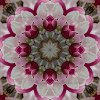
- pick a photograph for the background layer - I picked part of this kaleidoscope that I made from a picture of our magnolia tree.
- duplicate the layer and add some bokeh with a bokeh brush - repeat this step several times, duplicating the last layer and adding more (different coloured) bokek
- duplicate the last layer, add the first letter of text - repeat until word is complete.
- once all the layers are finished, go to the Save for Web option and change the setting to save as GIF (rather than jpeg) and click animate. Change other settings as you'd like.
- save in a Picasa web album.
From that point I followed the instructions in the Code it Pretty tutorial. I had a problem placing it above the inlinkz gadget, but I left Marie a comment and she responded quickly with a link to the fix for that.
So, I'm very happy with my new automatic signature! If you don't already have a signature why not give it a go too?
I recommend that you take a look at Marie's Code it Pretty blog. She has some great tutorials on all kinds of things to make your blog look pretty too!
Till next time, happy days!
Happy

This was the criteria for the latest challenge at the 123 Challenge blog:


From the recent Balloon Festival when Kyaa and I went down to
the lake to watch the hot air balloons I had lots of photographs of balloons so
the balloon part was easy! While we were watching the balloons drift over the lake,
we witnessed a balloon land awkwardly on the embankment and went over to offer
assistance. The pilot Craig was most grateful and had us help to manoeuvre the balloon
to more stable ground then let his passengers out. He also got me to help
deflate the balloon by pulling on the cord to release the air from the top. To
help that process along he had me sit on the deflating balloon to stop the air
from coming out the bottom. So Kyaa took a photo of me and Craig decided that
he should "scold" me. He was quite the character and in the end had
us all in stitches. It was an unexpected and fun early morning experience - happy
part of the challenge - check.
As it turns out, that balloon was red and yellow, so red
part of the challenge - check.

I picked a sketch by Kimberly Figures that I had come across
on Pinterest . I then went through my stash and found a series of red papers
that went with the red from the pictures. I picked a label tag from my stash
and die cut a second label (Die-namics Layered Label) from a larger pre cut tag and layered it on top of the first label.

To finish the layout, I stamped the flourishes using the
Stampin' Up! Baroque Motifs stamp set, and added a few flowers I picked up at a
$2 shop. I also added a few hot air balloon stamps from the Kaisercraft Up, Up& Away stamp set. The title was die cut with the Die-Namics By the Letters
dies.

 I always save used postage stamps that I like and I found
one in my collection of a hot air balloon that was just the right colours and
stuck that in too. I have so many used stamps but rarely get to use them, so it
was nice to come across this one that worked so well.
I always save used postage stamps that I like and I found
one in my collection of a hot air balloon that was just the right colours and
stuck that in too. I have so many used stamps but rarely get to use them, so it
was nice to come across this one that worked so well.
To finish off the layout, I felt that there was something
missing, but I wasn't sure what. In the end I had this roll of washi tape lying
on my desk and decided that I would use it as a border around the page. I think
it finishes the whole thing off nicely, don't you?
Till next time, happy days!
Celebrate Spring!

I love the colours of this latest layout which I made for
the Frosted Designs Sketch and doily challenge. A friend from new Zealand
sent me the large red doilies with our last ATC swap so it was great to be able
to use them.
Usually I stick pretty closely to a sketch but I wasn't a
big fan of the banners - I know it's all the rage now, but they're not really
my thing and I rarely use them on a layout. So, I missed them out, but used
most of the other elements.
 These photos are of the white climatis and intertwining
jasmine vine buds which take over our side fence in spring. It's a beautiful
sight! I just had to capture them on "film". I'm glad I could
scrapbook them for this challenge.
These photos are of the white climatis and intertwining
jasmine vine buds which take over our side fence in spring. It's a beautiful
sight! I just had to capture them on "film". I'm glad I could
scrapbook them for this challenge.
The layout was fairly straightforward. I cut out some
doilies from paper scraps I had in my stash using the Die-namics Decorative Doily
and Cheery Lynn English Tea Party doily dies. The butterflies were cut/embossed
with the Stampin' Up! Beautiful Wings Embosslits die, and the leaves were cut
with the Stampin' Up! Little Leaves Sizzlet die.

I contemplated for some time over what to do with the background
- it was too plain, but I didn't want to add any more papers or embellishments.
I settled on some stamping and used my (new to me) Stampin' Up! French Foliage stamps
to randomly stamp the French script and ink splatter stamps in red and yellow.
I think that filled in the space very well.

Finally I used some letter stickers for the title. I had
wanted to stamp it too with the word celebrate in Ali Edwards type script
stamped over top of some large alphabet stamps for the word spring, but none of
my meagre supply of alphabet stamps would work, so I went stickers instead.
While it's not the look I had hoped for, I actually think it worked better
because I would have had to put the stamped title on the background cardstock
so it would show up, and then it would have been too high on the page. So,
ultimately it was a good result.
All in all, I'm quite pleased with this layout - not my
favourite, but definitely not my worst! What do you think?
Till next time, happy days.
30 April 2013
Tana

Another Bali layout. I will
be coming to an end of them soon … I promise …
This one is about our driver Tana who drove us from Tanah
Lot to Ubud, and a few days later from Ubud to Seminyak. He was such a friendly
fellow and knew all the places to take us. We gave him an open-ended brief as
to where to go on our way from Tanah Lot to Ubud and he took us places we
hadn't necessarily thought about. He was very thoughtful, and even though his
English wasn't always the best we had a great time together. I can highly
recommend him and if you're ever travelling to Bali ,
I'd be happy to pass on his email ☺.

Anyway, the layout! This one was for the Stuck?! Sketches - April 1st sketch challenge. The sketch was fairly straight forward as is my final result. Still,
I like it. I guess I just really like simplicity. All the papers,
cardstock, embellishments and letter stickers came from Collage Press - Knave of Hearts Collage Crafting
Kit. My only addition not from the kit were the rhinestones from Kaisercraft
(colour: split pea).
 I really liked the fact that one of the papers in the kit
was a large bingo card sheet. Several of the squares were 'stamped': Reserved for
personal use only. I thought that was pretty apt seeing as the only people Tana
was driving those days were members of our family ☺.
I really liked the fact that one of the papers in the kit
was a large bingo card sheet. Several of the squares were 'stamped': Reserved for
personal use only. I thought that was pretty apt seeing as the only people Tana
was driving those days were members of our family ☺.
So, that makes six online challenges completed this month! WOW!
I've never been on such a roll. I completed the challenge kit from my LSS,
Wrapped in Paper this month too and turned that one in today. If I get a chance
I'll post about it as well.
I'd love to hear your comments on this layout or any others
if you get a chance. Sometimes I wonder whether there's anyone out there
actually reading my ramblings?
Till next time, happy days!
29 April 2013
Mask Painting


For this month's Scrap the Boys challenge I made this layout
about my boys (hubby and son) working at painting traditional wooden masks at a
workshop in Ubud, Bali .
 This month's challenge was a sketch challenge, and I can't
resist those, especially since it was a Page Maps sketch! I widened the 8.5"
x 11" sketch to make it fit a 12"x12" page and started putting
it together. That happened really quickly. It's a relatively "flat" layout
without much dimension, but I'm pleased with the result. I used the scraps from
the glitter border die cut I used on this layout, as well as cutting some FancyThat Fiesta Flags from the glitter paper.
This month's challenge was a sketch challenge, and I can't
resist those, especially since it was a Page Maps sketch! I widened the 8.5"
x 11" sketch to make it fit a 12"x12" page and started putting
it together. That happened really quickly. It's a relatively "flat" layout
without much dimension, but I'm pleased with the result. I used the scraps from
the glitter border die cut I used on this layout, as well as cutting some FancyThat Fiesta Flags from the glitter paper.
The papers are from my TLC stash. I typed the journalling
out on the computer, then printed it on a scrap piece of cardstock. Then I die
cut it with the Papertrey Ink Fillable Frames #10 cutting die. I added a bit of
gold gel pen around the outside of the journalling piece, as well as around the
title letters. They're from Basic Grey.

Well, it's simple, but I like it - what do you think?
Till next time, happy days.
Francine
Subscribe to:
Posts (Atom)