This is my latest layout, made with the Wrapped in Paper monthly scrapbook kit. It had two sheets of Bazzill cardstock, and several sheets or part sheets of various beige/brown patterned papers. There was a length of brown ribbon, some blue/brown ribbon and the white string as well as two turquoise/silver brads.
Now to
enter the competition each month you need to use at least a little bit of
everything in the kit. There's usually something in there that I find difficult
to use, and this month it was two things: the brown cardstock with the houses
heat embossed on it, and the Graphic 45 kraft range paper with the cards on it.
While I love both these papers, I didn’t feel that the brown one matched the
other colours in the kit, and I didn’t know how I was going to incorporate
cards into my layout either. I thought on this layout for days (well, probably
more like weeks!) and finally came up with the photos to use. Then I checked
all my sketch sites and Pinterest to come up with a layout idea. Finally I had
a few sketches and layouts printed out that I was going to follow, and in the end
I went with something completely different!
 I ended up
using a sketch (no 274) from Scrapbooks Etc page sketches. Of course I kind of
followed the sketch, but made several changes to it as well. The fancy die cuts
were made using my Spellbinders Ironwork accents die, while the small blue die cut
in top right hand corner was made with long die from the Die-namics layered labels
die set. I also added a few Kaisercraftpearls, and a button, sewed on with some
floss. The letters for the title are old Delish Designs (can't find a link,
sorry) that I had left over, with not quite the right letters left, but you
know, p's and q's make good o's when you cut off their legs *wink*.
I ended up
using a sketch (no 274) from Scrapbooks Etc page sketches. Of course I kind of
followed the sketch, but made several changes to it as well. The fancy die cuts
were made using my Spellbinders Ironwork accents die, while the small blue die cut
in top right hand corner was made with long die from the Die-namics layered labels
die set. I also added a few Kaisercraftpearls, and a button, sewed on with some
floss. The letters for the title are old Delish Designs (can't find a link,
sorry) that I had left over, with not quite the right letters left, but you
know, p's and q's make good o's when you cut off their legs *wink*. 
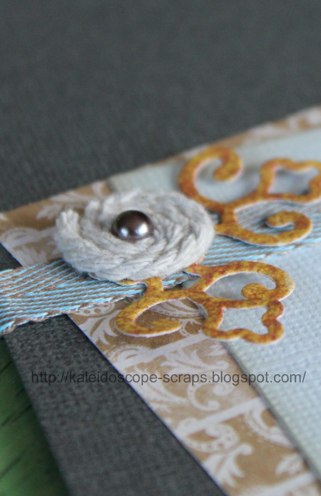 I used the brown
ribbon to make a rolled ribbon flower using this tutorial, although I used double sided
tape rather than hot glue to put the ribbon on to the circle. I also put some
red liner tape onto the circle of the corner die cut (on the ribbon, towards
the top, far left side of layout) and then simply wound the string around and
added the pearl. I had a bit of the brown paper with the embossed houses on it
left from the strip behind the photos (can't waste it by covering it up!) and
just cut the sun and house out to add to the top embellishment cluster. Same
with the King card, I cut it in half, so still have half a card to use on
something else.
I used the brown
ribbon to make a rolled ribbon flower using this tutorial, although I used double sided
tape rather than hot glue to put the ribbon on to the circle. I also put some
red liner tape onto the circle of the corner die cut (on the ribbon, towards
the top, far left side of layout) and then simply wound the string around and
added the pearl. I had a bit of the brown paper with the embossed houses on it
left from the strip behind the photos (can't waste it by covering it up!) and
just cut the sun and house out to add to the top embellishment cluster. Same
with the King card, I cut it in half, so still have half a card to use on
something else. 
Anyway,
enough of an explanation, do you think I might win? I doubt it because my style
is quite simple and someone else who enters each month has a shabby chic style
with lots of embellishments, so, to the average person coming in to the shop,
theirs always stands out. Still, I like my layouts and in the end, that's all
that matters :-)
My son commented
that he thought it was a strange thing to make a layout about, but if you
follow my blog at all, you'll know that I do that from time to time and scrap
about different things like plants and insects as well as my family and our
trips! I loved this stonework on the Parliament Buildings in Ottawa, Canada,
Till next
time, happy days!
Francine