Close to my Heart scrapbooking and cardmaking products

I'm an independent Close to my Heart consultant! If you're interested in our wonderful line of products, you can check them out or order online on my website at: Francine.cmth.com.au


24 October 2010

Six Artist Trading Cards

In July I participated in my first Artist’s Trading Card (ATC) swap with my friends on CRII. For those of you who have never made an ATC before, they are small cards - 2.5" x 3.5" in size. They began as ways for artists to trade information, but many different kinds of artists, including scrapbookers have started making them now. In scrapbooking/card making circles they make great swap items as they are relatively easy and quick to make. These are the first ones I have ever made, and I think I'm hooked now! (You can see some great ATCs on this blog.)

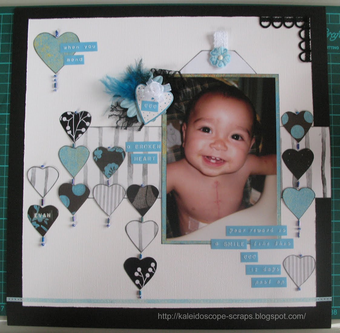
But back to my story... In the first swap I took part in there were two strings with 9 people in each. The first challenge string was to use a button on the ATC. Here’s my take on it.

It was made from scraps that I had. I stamped the SU! butterfly stamp onto a piece of white cardstock with some rainbow ink that I had not used in years. I cut the butterfly out, then stuck it to a piece of yellow gingham paper which I had rounded the corners of. I strung some seed beads on to make the butterfly body, and sewed some antennae on with silver thread. I sewed a silver swirl onto the patterned paper and added the requisite button. I stuck the patterned paper, butterfly and button onto some yellow cardstock and wrote the word Life in purple pen on the side. I finished it off with a doodled border in purple pen.

The second challenge string was to make an ATC using black and white and one other colour. I decided to use gold. I had an idea, but when I started to make it it turned into something completely different! In the end, this is what I made.

I stamped and embossed the angel onto scrap white cardstock, then cut it out. I printed the saying “Friendship is a knot that angel hands have tied” nine times onto white cardstock. I overstamped it in gold ink using my “En Français” SU! stamp. I punched it out with a SU! label punch and drew a border around the edge with gold pen. I then made a friendship knot from gold ribbon. I used these instructions.
After cutting the black and white patterned paper (from my TLC stash), I distressed the edges and attached it to the black cardstock base. I added the angel stamp, the friendship knot and the saying, which I attached with gold eyelets and rhinestones. I stitched a small corner using daisy chain stitch in gold thread, and added a gold photo corner sticker. This was my least favourite of the two ATCs I made, mostly because it didn’t turn out how I had envisioned it in my head.

I really enjoyed the whole process of making the ATCs and was keen to participate in the second swap in August/September. There were 9 people again participating in two strings. The theme of the first string was “hot pink and orange”. I decided to use the new Kaisercraft flourish stamp I had recently purchased. I wanted to try using the emboss resist technique. Unfortunately it didn’t work the way it was meant to, probably because I was using the wrong type of ink, but it still turned out ok. I ended us stamping everyone’s initials in hot pink and cutting them out. I attached each letter along with a felt flower from the Flower Fusion set from SU! using a brad. Finally I attached the stamped design to a piece of hot pink cardstock. I think these turned out really nicely.

The fourth cards that I made were about birds. These are my favourite ATCs of the bunch. I printed the saying “It is not only fine feathers that make fine birds. ~ Aesop” onto some green SU! patterned paper. Then I just started adding feathers and cardstock leaves punched out with the SU! two step bird punch. I finished each ‘nest’ with a little cardstock bird from Scrapmatts which I had coloured with my Sakura pens. Each ATC was slightly different because of the feathers, but each one turned out nicely. It was hard trying to decide which one to keep for myself! Here’s what they looked like.

This month, I entered another ATC swap at CRII. There were only 7 people participating this time. The theme for the first string was Pink & Lime, a Tropical Christmas. For some reason the first thing that came into my head was palm trees. So I set out in search of palm tree clip art to download from the internet. Sadly I didn’t record where I found this tree (so if anyone can tell me, please do so I can give proper credit). I printed seven copies on thick white card, and coloured them in with my watercolour pencils, then cut them out. I stuck them to the pink cardstock, added a little bell with lime green floss, and stamped a Merry Christmas circle stamp (maker unknown), with a small square stamp from studio g (VC0012 Series 32) and inked the edges of the card, all with SU! green galore ink. I added a bit of sparkle with my pink Sakura star pen to some of the stars between the Merry Christmas words. Here it is.

The last ATC that I made is one of my favourites. The theme was Gothic Arch. There are some absolutely stunning samples out there on the internet which made my first attempt look absolutely juvenile. I ended up redoing them. I printed my saying “open your heart and let your love fly free” onto some green TLC paper from my stash. The font I used is called Angelic War. I can’t find any reference to this saying anywhere. As it just popped in my head, I’m thinking that I made it up, please correct me if I’m wrong though! Anyway, I cut the words out and used my distressing tool to distress the edges of the paper. I then stamped the SU! kiwi kiss green cardstock with clear Versamark ink. I used the butterfly, flowers and swirls stamp from Autumn Leaves Block Stamps 2. then I cut out the gothic arch shape from the cards. Next I stamped the border stamp from SU! vintage vogue set in bronze versamark ink along the bottom of each card. Then I stamped the flower swirl stamp from the same set at the top left side of the arch. I punched the hearts from some scrap paper from my stash and then it was time to put it al together. I added a gold heart brad to the cards, then realised that I was 3 brads short! I ended up using Stamp N Bond to add glitter to the brads. Then the gold ones didn’t look good anymore, so I glittered them too. I added some pink coloured wings, antennae and a little trail to each brad so it looked kind of like an insect. When I showed the new card and the old card to Logan he said the new ones were a gazillion times better! I agree! I hope the ladies like them.

I’d love to know what you think of my ATCs. Please leave me a comment, I love reading them. It’s great to know I can share my work with people all over the world through my blog.

Till next time, happy days!

Francine

Mend a Broken Heart - Take 2

You may have seen my layout here, about my daughter's open heart surgery as a baby. While I made it for a Page Maps competition, it was kind of inspired by the fact that one of my online friends in the US was going through the same thing at the time with her grandson. Well, Evan has had his surgery and is well on his way to a full recovery. I really liked my layout of Kyaa and asked whether I could do a similar layout for Evan. I'll be sending it to his parents next week.

Kyaa's layout used the black and white monthly competition kit from my LSS. I just added all the pink touches since she was wearing a pink top in the photo. Since I still had enough paper left from the kit I made Evan's exactly the same, but with different embellishments and I used blue instead of pink. Kyaa actually likes Evan page better than hers, but then she doesn't like pink! I like the blue version too, but I still like the pink version as well.

Enough chit chat - here are both layouts side by side so you can judge for yourself.


I think I'm going to change a few things on Kyaa's layout before I hand it in for the competition, like adding some feathers to the chipboard heart embellishment, and doing the white lace as a pull on the tag like I did on Evan's (If I can get it off first without damaging the layout!), and changing the clear DYMO tape for pink at the bottom of the layout.

I decided also to enter Evan's layout into the Southern Girls challenge. You can do anything as long as you add glitter. Well, all the blue colouring in was done with my Sakura star pens which add lots of glitter, and the 'lace' type border along the bottom is also glittered. It was white to begin with and I actually rubbed ink over it to turn it blue. It turned out really well IMHO. Here are some close up pics so you can see.


Even the flower I used on the chipboard heart embellishment has sparkle in the ribbon!


Speaking of glitter, I was making a set of Artist Trading Cards last night as well and I ran out of gold heart brads. I was three short, and yes I should have checked how many I had before deciding to use them, but I didn't, so I had to come up with something else. Well, I used different coloured brads and used Stamp N Bond adhesive powder to add gold glitter to them. I hadn't used this product before and it worked great! Here's what the previously green heart brad looks like now:


I'll do a post soon about the ATCs I've been making recently so you can see the whole thing that I used the brad on.

Till then, happy days!

Francine

10 October 2010

Geocaching in the Aussie Bush

There's a blog I like to look at called Ideas for Scrapbookers. There are lots of great layouts for inspiration, tutorials and best of all templates to follow! Pam Callaghan is the blog owner and the maker of all these wonderful templates. I really liked her latest template and couldn't resist downloading it and making a digital layout with it. I didn't download the PSD template, just the jpeg of the frame itself. I then made a similar but different (IYKWIM!) layout with it. Here's the frame, and my layout.


I started with the frame and used a clipping mask with this kaleidoscope made from the photo of lichen on a rock (also shown here).


I then added the background colours, taken from colours in the photo. I added the photograph and some special effects. Finally I added the text. The font is JoeHand. I'm pleased with how this turned out. Now if I could only find a place to print these digital layouts in Australia at a reasonable price I'd be completely satisfied!

Till next time, happy days!

Francine

6 October 2010

Mend a Broken Heart

I made this layout for the Ally Scraps sketch contest over at PageMaps. Becky accidentally used this sketch for her last contest as well, but I don’t mind since I love this sketch and I couldn’t enter the last contest as it was only open to US residents. Initially it was a real toss up as to which photo I would use. In the end, I opted for this photo of Kyaa, taken ten days after her open heart surgery when she was 10.5 months old. I think it is my all-time favourite photo. She is so full of life and happy – you would never know she had had three and a half hours of heart surgery and been in the paediatric intensive care unit only two weeks earlier! The hearts in the sketch also just kind of leant themselves to use this picture too. So, want to see the layout?


Here’s the sketch it was based on.

I combined this challenge with the monthly Layout kit from my LSS, Wrapped in Paper. Once again I forgot to take a picture of the kit before I started cutting it up, but basically it contained two pieces of Bazzil cardstock – white and black. It also had two 6” x12” pieces of double sided patterned paper as well as a 6”x6” piece. I don’t know who any of them were made by, but they were all black and white. There were also 3 pieces of lace (1 white, 2 black), a large black flower, a large skeleton leaf, a flocked lace like border sticker, a large white shipping tag, and a gorgeous small white rose. One of the rules of the monthly competition is that you have to use at least a little of everything. That was hard with this sketch, since there was only one spot for ribbon/lace, and nowhere for the flowers or the tag. So I improvised, and added them – but then, that’s what using a sketch is all about, using it as a base and then making it your own.

I also wasn’t enamoured with the fact that the papers were all black and white, and the 6”x6” piece was actually black and cream. I fixed that one by colouring in the cream dots on one side, and the cream flowers on the other with my pink Sakura stardust pen. (Are you sick of hearing about these yet? They’re my favourite ‘tool’ at the moment if you hadn’t guessed!) I also added the pink and white daisy paper as a mat under the picture, and for two of the little hearts, as well as another piece of pink paper for the larger heart. These were all in my scraps. The white chipboard heart is from my TLC days, and the journalling/title was made with my Dymo Caption Maker and some pink (and some clear) Dymo tape. I put the tag for some journaling in the pocket behind the photograph. To finish off the layout I stitched on some beads instead of stitching through the hearts themselves as in the sketch.


The dymo tape says: When you mend a BROKEN HEART your reward is a SMILE like this {3 heart symbols} (10 days after open heart surgery).

I really like how this one turned out. I hope you do to!

Finally - on another note - subconsciously I think one of the reasons I decided to use this photograph today is because, little Evan, the grandson of my online friend Kathy, is having open heart surgery in the US today. He has a similar problem to what Kyaa had, but in a different area of the heart. His family is full of trepidation about the whole thing (who wouldn't be?!). Having been through it though, I'm sure it won't be long till young Evan has as gorgeous a smile on his face as Kyaa did. Mandy, Kathy, Obee and Ed, we're thinking of you today and await the news that all went well with Evan's surgery!

Till next time - happy days!

Francine