Close to my Heart scrapbooking and cardmaking products

I'm an independent Close to my Heart consultant! If you're interested in our wonderful line of products, you can check them out or order online on my website at: Francine.cmth.com.au


12 July 2010

Apron Strings Summer challenge #8

My Croppy Summer assignment #8 over at the Apron Strings blog comes from Elizabeth Kartchner's "52 More Scrapbooking Challenges": Use Media to inspire your next layout; books, CD's, DVD's, movies. . .

I found this article in a magazine I was reading and while I like the title, I didn't really notice that till later. What immediately caught my eye was the grid pattern of the photos and the way the words overlapped the photos on the right side. So that is what I mimicked. Here's my layout.

(Sorry about the picture quality - it's night here so there was no natural light!)This layout came together quickly other than the time it took to resize all the photos. I used a scrap of paper (Basic Grey, I think) on white cardstock. The title is made up of letters from ki Memories icicles, Been There Done That (rub ons), and Heidi Swapp ghost alphabet. The embellishment in the top corner is from a2zscraplets. I painted it with Twinkling H2Os. The photos come from our trip to the Amazon in 2007.


Well, I've run out of steam and need to go to bed, so unless I get up early (highly unlikely seeing as I'm a night owl!) I don't think I'll get to assignment #7. I guess only the morning will tell.

Till next time - happy days.

Francine

11 July 2010

My Croppy Summer Assignment #6


I decided to do the Apron Strings "My Croppy Summer Assignment #6" as well. I'm not sure if I'll get the other two assignments for this week done as well, so this will have to suffice for now! The challenge was to use the given sketch. I love Page Maps sketches, so this was relatively easy. The hardest part was deciding which photograph to use, since I usually scrap multiple photos rather than just one. (OK, OK, so my last post was a layout of a single photo too :-) I didn't say I always scrap multiple photos!)

Once I decided to use a photograph of my grandparent's house the rest just kind of came together quite quickly. I used a piece of DCWV cardstock, and patterned papers from the Brocade Background Stampin Up! designer series paper. The ribbons and gold brads came from my stash, as did the Cherish embellishment (I think I bought that from the dollar store when we were living in Canada). The hat pin is from CK (and is much greener than it appears to be in the picture), and the chipboard flower is by Porta Craft, and painted with Twinkling H2Os. I punched the centre flowers fom the patterned paper with my Sullivan's daisy punches. I used DMC floss to stitch around the circle, and made the tag with a scrap of kraft coloured cardstock. Since I had too much journalling for the tag, I made it as a fold out booklet/tag and created a kind of sleeve to slide it into on the layout.
The title is simply a photograph of the street sign of the street where they lived.

I think the whole thing turned out very well. What do you think? Now I just need to decide if I've got time to do 2 more layouts before the challenge cut off time!

Till next time - happy days!

Francine

Paper only embellishing

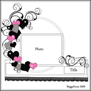
This layout has been in my head for a while, but I tweaked it when I saw "My Croppy Summer Assignment #5" on the Apron Strings blog. I used a sketch from Beggahuna as the basis for the layout. Since the Apron Strings challenge was to use only paper on the layout, that's what I did. I created some kaleidoscopes from the photo I was using and used them as embellishments, but I decided it wasn't really cheating since it was just that I was using a lot of photos! So here's the layout:

I used a piece of kraft cardstock for the background, cut the circular form from a piece of black/cream circle patterned paper from Kaszazz's Ebony & Ivory paper range, as well as the flourish and scallop from the ribbon/script paper from the same range. I used my anywhere hole punch to punch holes in the scallops to gussy it up a bit. I used a Studio G Clear Stamps stamp (VC0012 Series 32) on some of the cream off cut from the circle and interspersed these with my kaleidoscopes which I printed in different sizes. I also used my new extra large two step bird punch from Stampin Up! and punched a number of branches/leaves from some scrap cardstock. I punched a bird as well for the embellishment on the right hand side. I used my jumbo alphabet stamp to stamp the letters of the title on the same scrap cardstock and cut it out by hand (since I don't have a diecutting machine). I outlined it in gold pen and put it onto some scrap cream cardstock. To finish off I wrote the journalling in the top right hand corner.
The layout turned out pretty much as I envisioned in my head so that's great! Here are some close up photos.

I'll post my layout for the #6 challenge soon.

Till next time - happy days!

Francine

7 July 2010

Sketch Competition entry x2

OK - so I'm a bit late blogging about these entries, but better late than never as they say! As I've told you before, my Internet scrapping friend Ingeborg has a sketch competition every month on her competition blog here. She picks a sketch from the latest PageMaps sketches and asks her friends all over the world to make a layout based on that sketch. You have a month in which to do it. As is usual for me, I'm normally getting it in on the last day of the month. In June I cut it really close! I actually wasn't going to enter at all as I hadn't made the time to do an entry. But, at the last minute I decided to play with some brushes in Phototshop Elements and make a digital layout. It was actually after midnight on 30 June here, but in the Netherlands where Ingeborg is, it was still the 30th! Anyway, without further ado, here is the June sketch and my layout.


I picked the colours for the background from my photos then added brushes that I had downloaded from the Internet. Problem is I don't have a proper way of recording where I got them from, so unfortunately I can't tell you what they are or who they're by. Very naughty of me I know. If any of you can offer me a good solution for this, please let me know!

The photos were taken on our trip to Cairns in January. They were all taken in the rainforest, on our day tour to Cape Tribulation. The top one is a stick insect, and yes that is the colour it really is, I didn't fiddle with them! The middle one is some little orange bugs in a flower bud, and the bottom one is of fungus/mushrooms on a log. If there are any entomologists out there who can tell me the names of the bugs and the stick insect I'm curious to know.

Anyway, that was June and of course now we're in July, and guess what - I finished the July layout already!!! I guess the sketch just spoke to me, or maybe it's just because it's school holidays and I'm not working at the moment. Whatever the reason, I really like how this layout turned out. Here's the July sketch and my finished layout.


I did another "killing two birds with one stone" and used the Wrapped in Paper page competition pack. It was all dark papers, but I think suited these photos perfectly. The competition pack looked like this:


It had Kaisercraft patterned papers, a piece of A4 cream coloured cardstock, some black 12"x12" cardstock. two pieces of ribbon, 4 buttons two chipboard arrows, and two sheets of diecuts, one black alphabet, and one white diecut shapes. As per the "rules" I used at least a bit of everything.

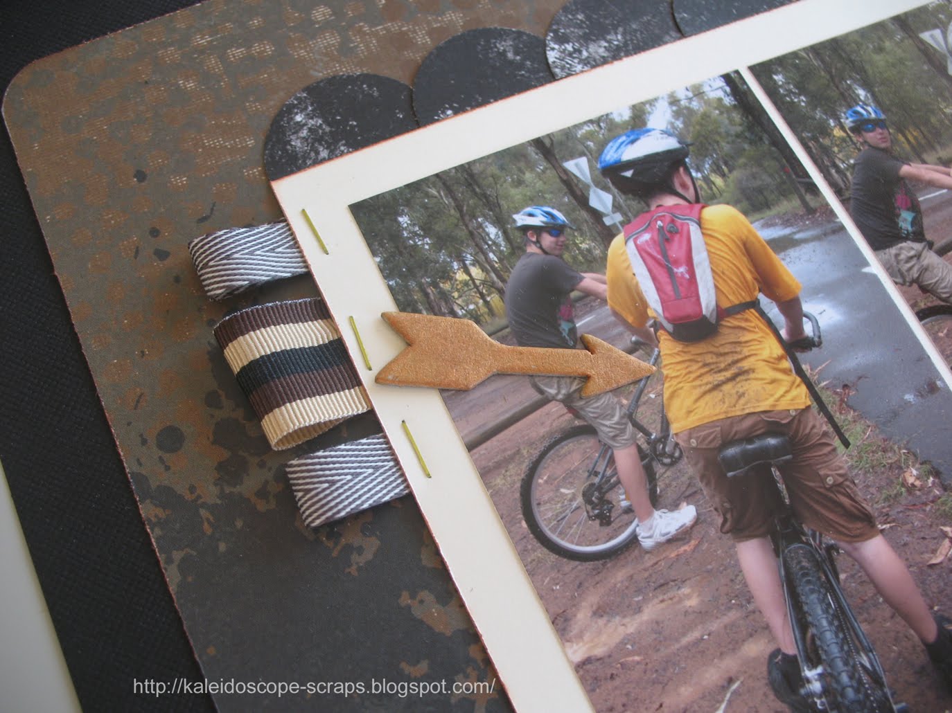
I punched circles out of one of the papers, cut them in half and made the scalloped border across the top. For the pinked paper edging below the photos I used my new pinking blade for my paper trimmer, and stapled it on with some yellow coloured staples. I used the same coloured staples to attach the ribbons. The orange flower and corners came from the diecut sheet. I painted them using my Twinkling H2Os. The chipboard arrows were painted with the same colour, but being raw chipboard they came out looking more brown than orange.

I also painted the black alpha diecuts for the title with Moonlight coloured Smooch so they look kind of grey. The only things I added from my stash were the circular bling (which was in fact buckle shaped, but I cut the middle buckle part off and put it under the journalling)from TLC/Breezy, some floss to attach the buttons, the blue and brown flowers, and my new 'Caption it' dymo machine for the date.

On a final note, I guess you could say I used this layout for three things! I also took a picture of it for the weekly photo challenge that I enter. A fellow Australian, Gayle, who I found through Ingeborg's competition site, runs two blogs where she challenges you each week with a different word. Your task is to take a photograph of something representative of that word, and she posts it on her blog. It's interesting to see the different takes that people have on the same word. So, if you're interested, get on over to her site: Capture that Word, or the kids one for children under 18: Captured by Kids.

Till next time. Happy days!

Francine

1 July 2010

June CRII Challenge

If you've been looking at my blog before you'll know that I participate in a monthly challenge at CRII, a private scrapbooking forum that I belong to. I found this month's layout sketch rather uninspiring.


You'll also know that I participate in the monthly layout challenge at my LSS, Wrapped in Paper at Nicholls. I didn't necessarily find the kit this month terribly inspiring either. Since you have to use at least a little of everything in the kit I really wasn't sure how I was going to use the punched tree, and the small 1/4 piece of patterned paper. I also didn't know what pictures to use with these colours. In the end though I found some pictures from our trip to New Zealand in January that went with the colours of this kit and decided to use this kit with the CRII challenge sketch.

Here's the result:


First I cut eight strips of patterned paper, different widths and lengths. I "cheated" on the middle orange piece since it really doesn't go all the way across the page. Remember that 1/4 piece of patterned paper? I cut a strip from that, then cut it into three pieces and hid the cuts under the photos in the middle of the layout. I laid the photos on top and the layout looked very bland, so I got the sewing machine out and sewed an orange border around each strip of paper.

Hmmm... it was still missing something. I left it alone and went to bed. Lying in bed I wished I had some glimmer mist, but I don't. Then I remembered that I had a couple of bottles of walnut ink that I had never used and went to sleep happy that I could probably make the layout better next day.

Next day I sprayed some terra cotta walnut ink in different places on the page. I don't know why, but it seemed to bring the whole layout to life and the rest was easy. I used the ribbon to make some corners top and bottom, and added a Kaisercraft Elegance epoxy brad to each corner. I used the Delish letters (lower case Alpha, blue)in the kit to make the title. Now...that punched tree! What to do with that? I tried several different things under and around the tree punch, and eventually settled on adding some tiny prima type flowers and flower brads from my stash. Under the tree I used some flower sequins I'd had in my stash seemingly forever. Unfortunately I only had two colours - yellow and pink, neither of which really went with the paper colours. So, I improvised and mixed a kind of orange, by adding a pink sequin on top of a yellow one, and voila!

The only thing left was to find a place for my journalling. The layout was already kind of busy so I couldn't really add it on the page anywhere, so I went for hidden journalling in the end. Not so much because I wanted it hidden, but more because that would work best. So, I punched a pull tab out of paper using Stampin Up!'s round tab punch and attached it to another piece of patterned paper. I sprayed the tag and stamped some lines onto it, then wrote the journalling and tucked the tag under the bottom photo. Can you see the pull out tab sticking out from the side of the photo? Here it is partly pulled out so you can see it clearer.

Considering I disliked the sketch and the papers to begin with I really like how this layout turned out! Gary said it was his favourite layout so far, and one of the women on the forum [hello :-) Kiwi] even suggested she'd like to lift the flowers in the tree idea! That made me proud since her work is always gorgeous!

If you're wondering about the photos themselves, they were taken at the Waikato Museum in Hamilton, NZ. There's a section with information about the settlement of the area and these old time clothes that you can dress up in. The kids went from school children to lady and gentleman in the space of five minutes!

By the way, if any of you live locally, I'd appreciate you visiting Wrapped in Paper and voting for my layout! I need some friends to add some votes:)

Till next time - happy days!

Francine

19 June 2010

Project 12 - May Layout

I really liked the sketch for the May layout for Project 12. It had space for 2 regular sized 4"x6" photos which I like. I don't always like cutting down photos so this was great. Here's the sketch we had to work from.

Isn't it great?!
So I used the same papers as I have used for this project so far. My pictures had a lot of red, green and blue in them, but the papers I had to work with weren't necessarily those colours so I had a bit of trouble deciding which ones to use. I think it worked out ok in the end though. What do you think?

I added two Porta Craft chipboard embellishments on the right hand page. I painted them with Twinkling H2Os. These have been around for a while now, but I have only just discovered them. They're great for painting chipboard, and I love the sparkle they add. The embellishment I used on the left hand page is from the paper kit. I mounted it with foam tape, just like I did with the title letters. I also used some purple grosgrain ribbon from my stash. I would have liked to use some ric rac as in the sketch but I didn't have any. :(

Here are some pictures of the individual pages of the layout.


and some closeups too:


Till next time then, happy days!

29 May 2010

Single sheets challenge

I completed a layout and card challenge for the CRII member's site that I belong to. The challenge was actually lifted from the Apron Strings Blog.

It was a double challenge to make 1 layout and 1 card from
1x sheet cardstock
1x sheet patterned paper
1x any chipboard accent
1x a couple of blossoms
1x length of ribbon
The creator Lori from Apron Strings blog says ..."Remember, besides a title and journaling no extra items can be used. If you need more cardstock to create your card, that is the exception."

Initially I thought this might be difficult, but it turned out to be relatively simple, considering that I'm a pretty simple scrapbooker anyway. I didn't use any ribbon, and didn't need the extra piece of cardstock and even have a bit of cardstock and patterned paper over! Want to see what I actually created? Here it is:


I really did only use one sheet of patterned paper - it was just that it was double sided so I got two different patterns from the same sheet. The paper is from the Urban Garden series from Stampin Up! For the layout I cut off part of the cardstock and the patterned paper. I then stuck them together to make one 12"x12" sheet as you can see from this photo of the back of the layout. I added the photos, and wrote some journalling onto strips of the reverse side of the patterned paper that I used my Stampin Up! word window punch to round the corners on.

The title "Hamilton" was made from some foam alphabet stickers that I painted with moonlight Smooch. The flower embellishment was made from the Roof Garden Accents & Elements kit of stickers/die cuts from Stampin Up! I painted the centre of the flower with Smooch too.


I used a raw chipboard flourish from Porta Craft. I painted it with gesso, then painted it again with the Smooch. Altogether I really like how this one turned out.

In case you're wondering, the photos were taken along the river front in Hamilton, New Zealand, during our trip there in January this year.

For the card, I cut a piece off the remaining cardstock and folded it in half so that it would fit into a DL sized envelope. I simply cut some narrow strips from the patterned paper, added a flower embellishment, and then a TLC rub on from my stash for the sentiment and the card was finished! That's the quickest I have ever made a card, but I think it is quite effective.


All in all this was a fun challenge - why don't you give it a try too and show me what you come up with!

Till next time - happy days!