Close to my Heart scrapbooking and cardmaking products

I'm an independent Close to my Heart consultant! If you're interested in our wonderful line of products, you can check them out or order online on my website at: Francine.cmth.com.au


Showing posts with label Online challenge. Show all posts

16 April 2012

Birdhouses


I had so much fun making these little birdhouses! I found the idea on Pinterest and would like to acknowledge Steffi Nitzpon who made the original card/birdhouses on which mine are based. I think they are so cute!


I had a set of seven ATCs to make so being able to set up a bit of a production line was a good thing. I cut out the black cardstock bases, then the blue patterned paper (from my TLC stash), and punched 14 sets of heart, then square from some left over book board/chipboard. I also punched 7 extra squares from the chipboard and using the Stampin' Up! 2 step bird punch I punched out the branches.

I cut the seven plain squares in half diagonally and then cut little nicks out of them to make the rooves. I used some fired brick distress ink to colour these pieces. For the birdhouses, I attached a scrap of red patterned paper behind each heart. Because the birdhouse was a bit raised, I attached a small (and I mean tiny!) scrap of book board/chipboard under the peak of the roof piece before attaching it to the birdhouse so when I stuck it own onto the ATC it would sit flat. Then I started my production line. To finish, I drew the line from the roof to the branch with black gel pen, attached the jute bow and used a few pieces of jute to make the post the lower birdhouse was standing on. To complete the piece I added a black diamante to each birdhouse.


I love how they turned out and hope the recipients do too!

I'm entering these in the anything goes challenge #20 at Challenge me Happy.

Till next time, happy days.
Francine

15 April 2012

Mount Sonder


I found a new (to me) challenge site, called My Creative Sketches. Being a sketch based site of course it's right up my alley. Here's my layout for the March sketch.

I actually made a digital layout first, but didn’t like it much, so made another one the traditional way. I'm quite pleased with the result. This is the one I'm entering in the challenge (since you can only enter one layout). 


I used PSE to alter the picture first - layered a black and white photo on top of a colour one, then 'cut' a circle out of the B&W layer, to show the colour underneath. I did it in a circle to mimic the circles in the sketch.
The circle doilies are made from kaleidoscopes I made from a picture taken on the same walk so the colours are the same as the main photo. After printing them, I cut them out with the Cheery Lynn English Tea Party Doily die.  


All the papers I used are from my large TLC paper stash, except the background paper, not sure where that one came from. The other dies I used were the Cheery Lynn Exotic Butterfly small and Cheery Lynn FancifulFlourish. I also used a chipboard twigs 02 (CB505) by Scrapmatts that I coloured gold with a Sakura star gel pen, and some chipboard heart punches I had laying on my worktable from my last ATC project that I also coloured gold. The letter stickers are Kaisercraft, 'Loire Valley', also with some gold pen added!


Here are a few close ups and the kaleidoscope that I used.


In case you were wondering what the digital layout turned out like, here it is.

I used a kaleidoscope I made on that one too. The kaleidoscope was created from a photograph of a rock pool - seaweed/plants and shells. All the 'papers' on the digital layouts were made using colours selected from the photograph, and brushes. I love digital brushes! Here's what I used:
fonts - Euphemia and Angelic War.
brushes (from PSE presets) - Special effects brush (azalea), and natural brushes, plus one that I downloaded as a freebie quite some time ago -- House of 3 - RhonnaSwirlCluster8.


At left is the kaleidoscope for the digital layout.


That's it for now - till next time, happy days.
Francine

28 March 2012

Breaking Dawn


Well ok, so my title isn't in fact Breaking Dawn, but rather Dawn Breaking (over Lake Burley Griffin). In my defence however, I had always intended to title my layout Breaking Dawn, it's just that I couldn't put the longer word at the top in the space because it would have looked funny, and with the subtitle it didn’t sound right either, so Dawn Breaking it was! Whatever the title though, I love how this layout turned out! It's my latest entry for the White with 1 challenge. This month's challenge was white + kraft + layering.

It was hard deciding whether something was classified as kraft or not, but hopefully I haven't really strayed from the rules, since I decided to consider anything that was a kind of beigey colour as kraft. That's how I interpreted it anyway and so this is what I ended up with.

I once again scraplifted this fabulous layout by CelesteVermeend. I scraplifted it once before too, here. Celeste's style really appeals to me, and I love her work, especially this particular layout, although I'm not even sure exactly why. But there you have it!
 

So, after gathering all my papers together I started cutting out pieces. I embossed almost all the cardstock pieces, and die cut lots of papers too. Everything comes from my scraps stash. The embellishments too are from my stash, the metal heart and the little humming bird have both been in there for about 7 years now I think! The Awesome (Memory Labels) tag and the flower (Magnolia Julia by Prima) were both hostess gifts for hosting a die cut swap, and some of the die cuts on here are from that swap as well. Other cutting dies and punches from my own collection that I used were:
the rectangle from the layered label die,
Stampin Up! label punch
The embossing folders I used were:
Script folder by The Paper Studio
Cuttlebug Swiss Dots
Couture Creations Houndstooth, and
Couture Creations Drink Me.
The jute was saved from a clothing tag, the letter stickers are from Kaisercraft (Duchess Collection) and Adornit (tiny etched natural). All the inking was done with Frayed Burlap Distress Ink.
 

I think this layout turned out  great, and there certainly is a lot layering. I actually laid everything out before I stuck it down, then took a picture so I could recreate it as I stuck all the pieces down! I'd love you to leave me a comment and tell me what you think.
Till next time, happy days.
Francine

25 March 2012

Discover


Every two weeks at Bird is the Word, they release a new word for that fortnight's challenge. They include a sketch too, although you don't need to use it. When I saw the sketch (by Mary Thomas) for the word Discover however, I just knew what I wanted to do.
I love taking flower and insect photographs so made a collage using one of the Scrapbooks etc collage templates (no 505) that I flipped and altered slightly. The quote "For observing nature, the best pace is a snail's pace." by Edward Way Theale, Naturalist, 1899-1980 is a photo of one of the quotes inscribed into the boardwalk at the Tidbinbilla Nature Reserve - it's so true. I then printed it onto canvas paper. Unfortunately this meant that the quote wasn't terribly clear anymore, but I still like the textured look.

Then I set about putting the layout together, following the basic design of the sketch. I used only things from my stash: cardstock from TLC, a remnant of some green patterned paper, some handmade paper covered by a piece of (Colorbox) printed vellum. I embossed the vellum with the Ornate Treasures Secret Garden embossing folder by Craft Concepts before layering it over the handmade paper.

The circle and frame dies were from a die cut swap I participated in (thanks Lainie!), and the Fanciful Flourish is by Cheery Lynn Designs. I layered a Martha Stewart butterfly punch over a butterfly cut with the Cheery Lynn Designs Exotic Butterflies (small) die. To finish off I added some Kaisercraft pewter pearls and some pieces of ribbon that I bought recently at Costco.

All in all, I'm pretty happy with how it turned out. Hope you like it too!

Till next time, happy days!
Francine

12 March 2012

I Love You!


 J'ai le coeur à te dire... by LN


A short while ago I pinned this great layout called " J'ai le coeur à te dire... " (I have the heart to tell you…) by LN on Scraptus. I loved all the layering of the circles, stars and buttons and just had to scraplift it. 

So, I came up with this. (Unfortunately the picture doesn't really do it justice, even though I had eight tries before I got one that was semi reasonable!) 

I used the papers, ribbon, "V" brad and heart eyelets from my LSS monthly kit. I felt that the red cardstock in the kit was just too overpowering with the rest of the patterned papers. So, because I wanted to enter the Frosted Designs Fabulous Friday Kraft Paper challenge, I toned it down with a piece of kraft paper I had in my stash. I think the colours go together really well.
I started by putting the kraft paper on top of the red cardstock, then stamped the Stampin Up! Medallion stamp in three places and embossed them with some Stamp-it violet pearl embossing powder. I used some fired brick Distress ink over part of the kraft paper. Then I tore a couple pieces of scrap paper and layered them over the Stampin Up! En Français background stamp before inking it up with the same distress ink. Because of the scrap paper on the stamp, I only got part of the stamp. I haven't stamped on my background much, but I love this effect so might have to try it more often.
I attached my black and white photos, then cut lots and lots of circles and other shapes from the Bo Bunny papers in the kit. The dies I used were:
I used the Sullivan's 1.5" star burst punch and the Stampin Up! multi-flower punch as well. I also cut a number of the words from one of the papers. I inked the edges of some of the lighter coloured die cuts with Bark Versamark ink, then started layering! I attached most of the die cuts with regular double sided tape, but raised some with foam tape. I also put the two bits of ribbon coming out of the top and bottom of the line of embellishments.
See the tiny heart in the middle of the  eyelet?!
I used the V brad over the V in LOVE on the circle near the bottom, and set the four heart eyelets into the cardstock and brown heart. Unfortunately this left a hole in the middle, but the paper with all the words also had the tiniest little hearts that fit perfectly in the holes so I cut them out of the paper and attached them behind the hole - problem solved quite effectively I thought!!


Finally I added a few bling hearts and flowers, printed and added the jounalling strips and I was done!


I absolutely love how this layout turned out, and for the first time in a while it came out better than I imagined. Of course it helped that these pictures of my son and I are great too.

Till next time, happy days!
Francine

3 March 2012

Sail


Here's my latest challenge entry. This one is for the PageMaps Webster's Pages sketch contest. I loved this sketch and had an idea in my head straight away, but as is often the case, the actual layout didn't turn out anything like I planned! About half way through I was ready to throw in the towel and forget the whole thing, but I persevered and I think it turned out well in the end!

I used the monthly kit from my LSS - Wrapped in Paper. The papers are from Bo Bunny (the yellowish one under the photos and the strip along the middle) and Kaisercraft (the green tag is the backside of the patterned paper frame around the layout). There was Bazzil black cardstock, a small strip of the dominoes patterned paper, the canvas tag under the flowers in the centre, the wire ribbon that I stretched over the canvas tag, the purple ribbon and the black lace ribbon under the paper under the photos.

See the misting and embossing?
I started out by stamping a Tattered Angels Garden Blossom Trees stamp in the centre of the page and heat embossing it with clear embossing powder. I stamped the tree with white ink, but that obviously didn’t work! I then put a matching glimmer screen over the tree and sprayed green glimmer mist over the top. It just turned out kind of muddy looking. At this point I was going to give up because the paper had buckled slightly, the mist didn't really show up and the stamp even less so. But, I don't like to waste anything, so I kept going and I think by adding all the rest of the papers and die cuts it all came together.


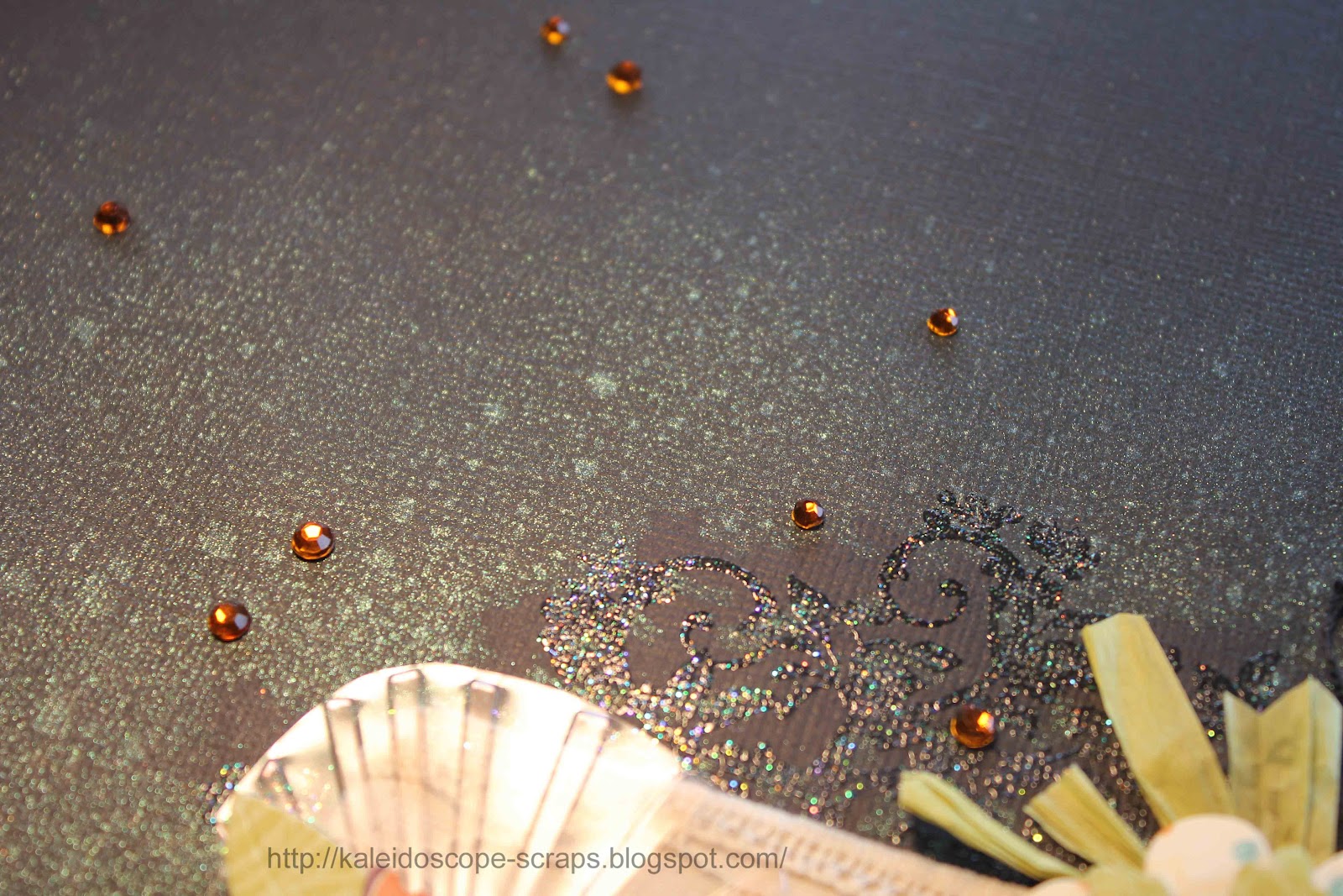
The dies I used for the die cuts were: Die-Namics framed greetings die (which I then cut in half), Die-Namics Prima Donna Petals, and Die-Namics Dog Tag. The green rafia behind the top flower came from some packaging I had saved, and I embossed a piece of acetate packaging with Craft Concepts Ornate Treasures Oriental Fans embossing folder. Before embossing I put some orange ink on the raised part of the folder so that it transferred to the raised part of the acetate. I then attached it behind the left hand flower although it's a bit hard to see in the photos. I used my Cuttlebug Baby Face alphabet dies for the title, then drew around the letters with my Sakura clear stardust gel pen. A few silver brads and some orange rhinestones and it was done.

The photos were taken last October while I was on a bike ride around the lake. The sails were so colourful I just had to photograph them.

Till next time, happy days.
Francine

28 February 2012

12 months, 5 continents, 1 Journey of a lifetime


Well, I obviously miscalculated something because I thought I had till the end of the month to enter the Bird is the Word challenge, but sadly it's closed. I must admit, this was my first time to enter one of their challenges and as they have several challenges going at once the closing dates are very confusing and I obviously didn't look correctly. So, instead you get to see what I created, and I love how this layout turned out!
The challenge word was Journey which you had to use either in the title or the journalling. In 2006/07 we took 12 months off work/school and travelled around the world. I haven't scrapped many photos from that trip and had been wanting to make a title page for the album, so this was a good excuse to do that. Hopefully this will kick start me to doing more pages for the album.  

I started with a sketch from Sketch Support. Their sketches are awesome and the fact that they give you all the dimensions for the paper pieces is even better! I had a travel album kit I bought a couple of years back at a craft fair and finally got that out to use it. The background is kraft coloured from Stampin Up. The papers I used are from Kaisercraft, and the chipboard, cardstock stickers, clear acetate ribbon and felt embellishments are from the Junkitz Destinations collection. The "Corroded Alphabet" title stickers are from Paper Loft, with the smaller letters being Been There Done That rubons. The date stickers are from Kaisercraft.

Initially, before looking at the papers I had, I had made a map to fit the bottom left spot, and was going to print it out with the words on it. Then when I saw the map on the paper fit the spot exactly, I decided to use that instead. I printed out my map, coloured the back with a pencil, then traced over the letters so they would transfer onto the patterned paper. It didn’t work perfectly, but it was good enough to be able to trace over with my Sakura gel pens.

I love how I could use lots of the chipboard, felt and stickers to make several embellishment clusters. All in all, I'm really pleased with how this layout turned out, and it's now the title page in my trip album! And in case you're interested, the photos are - top row: Grand Palace, Bangkok, Thailand; a park off Island Park Drive, Ottawa, Canada; Machu Picchu, Peru. Bottom row: Easter Island, Chile; Kinderdijk, the Netherlands.

Hope you like my layout - please leave me some comments if you do! Till next time, happy days!

Francine